Monday, 28 March 2016

Week 9 - Building the Set 2

Once I'd finished the flooring of the set, I began to work on the boards. I wanted the set to give the look of a cabin a it was the bear's home in the story. I used a foam board and stuck kitchen towel to the surface and began to paint with watercolours.


Once the watercolours had dried, I then began to work back into the wallpaper with a darker colour to add a sense of depth to the set.


I had to repeat this process three times over to have a three wall set, allowing the movement for the puppets to come from the exposed wall where the camera would be. I didn't want to allow space for a trap door as the set was quite low and I'd already tested the movement with my first armature.

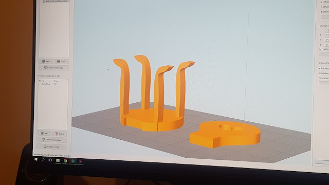
As the set was beginning to take form, I began to consider the furnishings inside the set, this worked really well and I was lucky enough to be able to 3D print some of the furniture for it. I found a few chairs, a TV and a table from a 3D printing website and changed the measurements to fit with my set.


When they had finished printing I painted them a brown-wood colour to blend with the rest of the set. This was so it maintained the cabin like feel I had originally wanted.


The 3D printed chair seemed to fit really well with the storyline and the colours worked well with my original colour theory and the colours of the set.

Additionally to the 3D printed furniture, I wanted to make some from the foam boards I had used for the walls in the set. The only problems I encountered with using the foam boards was the fact that the paper used to conceal the board underneath doesn't come off very well. This made it harder to indent the surface with a wood-like texture.


However, I did manage to give the appeal of wood by making sure I had shaded the areas that would give that type of texture.


I also began to add tiny details such as the curtains, frames for the walls, shelves, books and a porridge jar to set the scene for the bears.


Once all of the finishing touches had been made for the set, I began to assemble the walls to the floor. This part was probably the hardest in terms of making sure that I wasn't being too forceful with the foam boards so they didn't warp. 


After seeing what the set looked like, I wanted to hide the seams in the corners of the set. Therefore, I decided to create a skirting that ran up the wall and an old victorian coving. 


I then began to experiment with the furniture being in different places so the composition of the scene would never include the character having his/her back to the camera.


 This concluded with me adding a shelf and a door to the set, this enabled an entrance for the character and also the fact that I would always be framing them in the right way in terms of facing forward or being in full shot.


Week 9 - Building the Set

Building the Set for Goldilocks:

I began designing the set for Goldilocks after experimenting with the Foam boards in last weeks session. I visited Homebase and B&Q to get an idea of wooden flooring for the set. I decided on buying a packet of lollipop sticks to lay down and dry brush them with different textures such as cardboard or foam in-between to attain the ‘layering effect’ that most wooden floors have.
The main theme within the set was that it was going to be a ‘cabin’ theme as it’s the bears home in the woods for ‘Goldilocks’. 
This was one of the effects I wanted to achieve from the sample at the hardware store. I wanted the gaps to be visible so I could then screw in the foot movement for the character in the scene. This would allow the characters foot position to be directly on top of the wooden slats without looking as though she was ’tilting’ into the floor.
I began using the lollipop sticks as stencils to make sure that I had the same size shape throughout the flooring.
I then began aligning them in straight lines and glueing them to the board for the floor. I then made sure the gaps in between were similar throughout to make sure certain lollipop sticks didn’t look too raised or too far apart.
Once I’d finished the whole floor, I began to fill in the necessary gaps that would absorb the majority of the paint throughout the painting process.
I wanted to apply a base colour to the floor and then dry brush the remainder with a lighter colour to give the illusion of ‘strokes’ on the wood.
There were certain parts of the flooring that began to absorb too much of the paint, this was down to the fact that it was cardboard and a hardened lollipop stick. The lollipop sticks worked really well and gave the appeal that wood would usually give in a home usually. However, I did find I had to apply more paint on the cardboard areas to achieve the same effect.
Once I’d got an idea of how I wanted the set to look on the bottom, I began gathering materials. I used foam boards to create the walls and glued kitchen towels to them to make it seem as though the wallpaper was ‘cracked’ and give it a true cabin feel. 

Monday, 21 March 2016

Week 8 - Set Design 2

Experimenting with Foam Boards:

During the session this week, I was experimenting with different textures that could be applied to a set. I was given the task of producing 4 different types of Textures. 2 x Brick Walls, 1 x Cracked wall and 1 x Stone Walls.

I first began to colour swatch the walls I wanted from the reference material I had researched into. I applied a thin layer of a brown/grey base colour to sink into the cracks I had formed into the Foam. This allows you to paint over the top of the walls without having to go into finer detail repeatedly.

Once I'd managed to understand the colours I needed to present a realistic wall effect, I began to mould into the foam to create the appearance of a brick wall. I used a hair grip to get into the fine cracks of the wall and the remainder was done using the end of a pen. This process allows you to have the indentation of a brick wall and once the paint is applied makes the process easier because you don't have to paint on the shadows because they are already there.

I'd made the indents into the foam and then had to paint them with a base colour enabling it to sink into the cracks I had formed with the modelling tools. This then allows you to paint over the base colour with the colour you had planned for.
The base colour for the concrete crack was a shallow greyish. This was so I could paint over the top with a blue-ish grey to add to the realistic feel of concrete itself. This worked very well with the foam and the dry brushing the paint onto board allowed the texture itself to show up.


Monday, 14 March 2016

Week 7 - Facial Animation Research

Facial Replacements in Animation: (Research)

For the brief, I wanted to explore the technique used to make phonemes for the mouths of my characters. The process seems very straight forward in terms of making the facial parts. I would need to produce my own mould to make sure the size and shape of the face remained consistent throughout the Animation. 

I found a lot of images that would assist with this process - some of which differ in terms of their technique, although most of the Animators use moulds printed from Maya. 

I do appreciate the aesthetic of these faces, although they are not similar in terms of design and to use for an Animation that wants continuity. I love the way the necks on the characters accentuate the size of their heads and I feel as though this would be a different and quirky way to approach the construction of a character for Stop-Motion. It would allow the style of the walk to differentiate from other characters as you could 'droop' the neck to allow for more emotion from the characters.


If I were going to approach any facial Animation with Stop-Motion, I would most definitely lean towards this method as it allows you to cut out the phonemes for the mouth and add the parts onto the character. 

It would give you leeway for a smoother Animation and allow a more in-depth sense of emotion to be shown to the audience; this can range from adding in an eyebrow raise, to the cheeks puffing out to show despair. I feel as though the possibilities are endless with this method and that you would be able to manipulate the technique used here to my own Animations.


I found this video an interesting part of research as I was able to see how the facial rigs work on the character. Although the most intriguing part for me was how they continued to manipulate the characters using CGI as well. This gave an insight into using two different production means to produce the final product and give a more polished look to the Animation.

Although, with that being said I do appreciate the aesthetic and knowing that an Animation has been produced in 2D means. This is referring to the 'lines' on the face and the body of a characters where they've been made by the Artist. 

(Facial Expressions, Stop Motion Animation)
(Phonemes)


I love the detail for the wrinkles on these faces, I feel as though it brings a sense of realism to the characters. I would definitely love to experiment with having this on one of my characters, even for the bear around the eyes or the hands. I want to be able to make sure the Animation is realistic but playful for the audience. I feel as though the smoother and more defined the character, the more of a chance you have of the audience relating to their story and understanding the plot.


Monday, 7 March 2016

Week 6 - Set Design

Set Design:

Research Links: http://hubpages.com/art/diy-model-making-how-to-create-props-scenes-sets

I began researching into Set Design after the session and decided to create a moodboard to display the sets or aesthetic design I most liked. I wanted to narrow it down to three methods, some of which included a very simple, yet effective method of using paper in a 3-Dimensional means to create a set that was brought to life.


I then began to look into Youtube Tutorials to see how they make the small details for the scenes of the set. I wanted to add as much detail as possible to my set and by researching into this process. 


Set Design:

Basic Principles:
  • Design must be based on the storyline
  • Have flexibility as a criteria
  • Be aware of the camera
  • Consider lighting and mood from the outset
  • Wear the directors hat when designing the set.
Design:

The design must be based on the storyline with the characters taken into consideration and the appropriateness of the treatments. The set must reflect the continuity of the other developments of the film.
The scale of the set, this is important because more often than not you are dealing with miniature sizes of the human form and this must be reflected with the set. There are techniques you can use that you can get away with in terms of scale and set design. 


Flexibility:

The flexibility as a criteria with what you want as your final product. When you use props and other set elements in other scenes. When you are dealing with a full production you have to make sure you are scaling everything to match different scenes to see if you could get away with using them in multiple sets. 

You can have multiple people Animating one object and you need to make sure you have allowed space for yourself to make the movement with the characters. This will cause you difficulties if you are not aware of this when designing the set. The camera angles will need to be clever enough to allow you to maintain flexibility.

Camera:

The camera will be an essential element to the staging and framing you have in place. Therefore you need to be designing for the camera and not for the theatre. You should be designing the set with the purpose that the camera is your primary concern. 

Lighting and Mood:

The colour script is where it comes into it's own. You must be mindful wit the colours you are using and the mood you are implying throughout the film. This must be designed ahead of time for your stage.


By using Ambient lighting it comes from beyond the camera and automatically begins to create a much better atmosphere for the scene. This tends to hide any imperfections and gives you a better result. Light should direct the eye to a specific region of the set and should create an atmospheric, cosy feel to the shot.


Directing:

Everything you need to do for your shots has to be designed. If you aren't meant to see something, you don't need to plan for it. 'Vertigo' (Alfred Hitchcock)

'Whiteboard Design' - You complete a rough version of the set design to lay out everything to see if it would work for the Camera. Allowing you to see if the camera can maintain a sense of continuity within the film.

You can test your camera movement and lighting before investing a wide amount of time and allowing you to see if the scene or set actually works. 

Process:
  • Finalise your designs
  • Pin down the Treatment
  • Determine if you need backdrops or mats
  • Look for relevant materials for your set
'Madame Tutli Pulti' - Clyde Henry Productions


"The film Madame Tutli-Putli doesn't really mean anything at all. It does, however, tell the story of Madame Tutli-Putli, who has an extremely meaningful experience—a transformative experience. At the start, she is weighted down by her possessions. She is terrified when she sees the sign warning of thieves. Soon after, the thieves arrive, gas the passengers, and steal all of her stuff. On waking, she notices the thieves removing a sleeping man's kidney. After this is accomplished, one of the thieves moves close to her, indicating that she should be quiet. Apparently, they are not after her or her organs. In fact, one gets the impression that she is on their team—even if she doesn't know it. Her suspicion that this has all been a dream is quickly dispelled by the mud tracks left by the thieves." 

Kapa-Line Foamboard:
Many model makers use these boards to create set designs and usually you can use them to create white sets - this is generally a 'rough and ready' process. It can be used with a combination of Kapa Boards and the Blue foam used for the Maquettes with air drying clay.


For Next Week:
  1. Finish the design and execution of your sets
  2. Take Photographs of them (Not snaps, on a Camera)
  3. Take additional photos with correct lighting